30 December 2010

The World Seen through a Glass of Scotch

As I've often said, I love Kodachrome. Kodak pulled the plug on it about 18 months ago, but today the last roll is being processed at Dwayne's Photo in Parsons, KA.


Kodachrome was not just another film. It was for about 50 years the principal way that the world was described in color. As one photographer recently put it, "Study any color photo book from this era. Almost invariably you'll see the Kodachrome æsthetic: rich warm tones and relatively subdued greens, with deep shadows as an artifact of the slight underexposure required to get decent color saturation. As long as you kept the highlights under control, you'd reliably get that nice palette: lovely blue skies, subtle cool greens, and burnished warm colors with impact out of proportion to their size in the frame. To me it sometimes seemed like looking at the world through a glass of Scotch. For folks my age, learning color photography meant learning to see the world like K64 did."

28 December 2010

16 December 2010

Bandstand [Payson 18/52]

My photo Forgotten Shoes just hit 400 views on Flickr. What a trip. Anyway, another photo from my Gakkenflex. What's a Gakkenflex? That's another post I've been meaning to write . . .

Bandstand [Payson 18/52]

13 December 2010

Audio Bliss for a Ten-Spot

I'm an audio quality fetishist, to the degree a poor man can be. And for broke audiophiles, it's a great time to be alive. I've had a post-in-progress queued up for a while now on cheap audio bliss, but can't seem to finish it. I was going to talk about audio file formats and bitrates, players, headphones, etc. It can be a bit complicated.

But right now I'm listening to some Sting through $10 worth of gear, and it sounds superb. Really, truly superb. I have a whole pile of audio gear at my elbow, including a tube amp, $200 headphones, a hand-wired DAC, etc. But right now, to my ears, this sounds as good as any of it. And this rig is both cheap and dead simple:

One used Sony Discman portable CD player ($3 from a thrift store) and one pair Koss KSC75 headphones ($5 on closeout).

The Discman I picked up is a D-191 that is probably about 10 years old. It's beat up and has almost no features, not even a pause button, but it sounds much better than another Discman I own that is loaded with (mostly useless) features. There was a whole pile of players at the thrift store priced for couch change, and any random Sony in working order will sound good to terrific.

Koss KSC75 headphones are legendary cheap-fi darlings. Amazon sells them for $14. They are clip-ons, but a lot of headbands from other cheap headphones work fine (I use the bands from these $2 throwaways). The KSC75's are light years beyond anything else south of $80. Koss PortaPros are also very much liked, and cost just a bit more (with headband), but I have not heard them.

Of course, you also need CDs. And they're a big part of the bliss equation here. CDs contain much more audio information than mp3s, and a simple, quality CD player can resolve that detail very impressively. Sony figured out how to do that many years ago, and in fact made their best, and most expensive, portable CD players back in the '90s.

Quality mp3s on any current-model ipod, with the same headphones, sound a solid 80% as good as what I'm hearing right now. Lossless audio files might sound 95% as good. But this old silver disc and my salvaged $3 Discman still owns them.

08 December 2010

30 November 2010

22 November 2010

Moon over Walgreens [Payson 15/52]

I love this photo. I grabbed it out of my car window while waiting for a green light. The caption on the sign was serendipity. I didn't even notice it when I shot it.

Moon over Walgreens [Payson 15/52]

And Forgotten Shoes just passed 300 views on Flikr. What a trip.

17 November 2010

Photo Contest Photo Contested

I'd actually love to judge a photo contest, but I don't have thick enough skin. And you need it, because while there is no disputing matters of taste, everyone will dispute your taste. There are no good or bad photos, it seems, just good or bad judges.

I think anyone who is foolish enough to host a photo contest gets what they deserve, and the British Journal of Photography was given both barrels this past week for the winning image they selected for the single image category of their International Photography Award:


Man asleep on the Golden Mile, Durban, South Africa, by Michelle Sank

There are dozens of negative comments posted in response to the original BJP announcement and their subsequent defense of their choice. Their basic defense is that this image "defies simple photographic convention" and challenges the viewer. In saying that it "defies simple photographic convention," what they actually mean (I think) is that it's technically unimpressive and ambiguous. That is certainly the critical consensus.

Being unconventional might or might be a virtue for the judges. Commentators and bloggers have effectively said it is in fact very conventional, a conventionally unsuccessful photo. A prizewinning photograph, they say, especially outside of a body of work, has to provide its own context to be intelligible. It does that both by choice of subject and its technical execution. And ambiguity is not necessarily polyvalence or depth. A photo that can communicate anything communicates nothing. The original announcement called this a striking "image of poverty," but that was later revised because there is nothing to indicate that the subject is a poor person (the photographer indicated otherwise). The subsequent defense, by one of the judges, makes this lack of clarity about the subject a virtue.
He says, it "challenged my assumptions about photography." Critics say it certainly challenges assumptions about good photography, if we were to all agree this is good.

Much of this furor is just a collision between artworld and realworld. The judge's comments make this plain enough. But few photographers are interested in artworld photography and its frequent eschewal of traditional photographic values. And after all, this photo was given a photography award by a photography magazine, not an art award by an art magazine. No sane editor could present this to a body of photography enthusiasts and expect a positive response. I don't think it succeeds even as art. I expect the panel of judges were photographers trying to select something that looked like artworld art, not artworlders who happened to settle upon this photograph.

Though maybe this is just another referendum on the futility of photo contests. As one commenter says, "This is why photography contests, in general, are quite stupid. . . . On the one hand you get judges who get their jollies from picking bland and impenetrable pictures and on the other, literalist morons (see this comment thread) who can understand postcard shots but not much more. In the end, no one comes out ahead."

14 November 2010

10 November 2010

Ten Great Recordings (Pt. 2)

I'm listening right now to a 1959 recording of bassist Oscar Pettiford, Vienna Blues. It sounds more pristine than probably 99% of the pop and rock recorded and released this year. When I first started listening to jazz, I found it incredible that music recorded in the 50s could sound better than most music released today. The 50s and 60s were a gilded age for recording, a combination of great studios, great engineers, great taste, and surprisingly great technology. So at least one reissue from that age of legend needs to be included here.

Miles Davis, Kind of Blue (1992 Mastersound Gold CD) [SBM CK64403] - This 1959 recording is the #1 jazz album of all time. It was recorded at the famous Columbia 30th Street Studio in New York, a former church with the best recording acoustics of any studio, ever. It's been issued in an endless stream of editions, but this release is the first to fix a pitch issue that affected side one. The primary 3-track tape machine that they used to record it was running slightly fast during the side-one session. This Mastersound Gold CD was the first edition that used an alternate, correct-speed side-one master (the "safety" master), which had been lost since before 1984. It is expensive and rare, but the most recent 2009 Legacy edition, easily found, is also very good. This 2009 reissue is based on a 1997 remaster, which used an original vintage deck for the transfer, and has been much praised. It's warmer, more analogue, and has less stereo separation, and also less bite. But I personally think 1992 Gold release is the best there is. It sounds like you're right in the session.

Dayna Kurtz, Another Black Feather (2006) - A new discovery, this is a great album of eclectic Americana from a brilliant but obscure artist. A reviewer of an earlier Kurtz album lamented, "there's no logical reason why singer-songwriter Dayna Kurtz is not a full-blown star." It seems like the smaller the label and more obscure the artist, the better the sound quality of the album. Forget the majors; support the indies.

Nirvana, Nevermind (1991) - My blog's name comes from a Nirvana lyric, but I have to mention them in this list due to the great production of their records. Nevermind was produced by Butch Vig, mixed by Andy Wallace, and mastered by Howie Weinberg. Weinberg did the mastering all by himself. Given a free hand, he could do, and did do, superlative work. Instrument separation is superb, the guitars crunch, the bass has grunt, the drums hit hard. This is what rock should sound like. Nirvana's next (and last) studio album, In Utero (1993), was produced by enfant terrible producer Steve Albini, whose records are always technical gems. Rounding out a trifecta of recording excellence, Nirvana's MTV Unplugged (1994) is as beautiful and shiny as really depressing music can be. When "Polly" starts, you feel just like you're sitting with Curt, Krist and Dave right there on stage.

ZZ Top, Tres Hombres (1973) [2006 remaster] - ZZ Top's back catalog has been rereleased in really excellent remasters. This is no small thing, since most rock remasters are worse than the original issues, due to loudness war compression aggression. But the vinyl remaster of Tres Hombres was done By Steve Hoffman and the CD remaster by Bob Ludwig. These are two of the best mastering engineers in the business. The vinyl is said to be a bit more dynamic than the CD, but the CD/digital version is still very good. This great reissue is partly an act of penance, since all previous CD issues are based on an early digital remaster that was really heinous. "La Grange" has never sounded better or boogied harder.

Tom Petty & the Heartbreakers, Mojo (2010) - This is Petty's first Heartbreakers album in eight years, and was worth the wait. I'd singled this out for inclusion here based the fact that it's been released in CD and vinyl, naturally, but also in downloadable 24/48 hi-res audio format. The CD is, sadly, a victim of loudness war compression, but the vinyl and hi-res digital are pristine. One of the reasons for this, it turns out, is that the tracks were recorded live in the Heartbreakers' rehearsal space. No studio slicing and dicing. Live recording rules.

Bonus: Sam Cooke at the Copa (1964) [2003 remaster] - A reviewer in The Absolute Sound (Oct/Nov 2003, 139-40) said this may be the most realistic recording of the human voice he had ever heard. Restored by Steve Rosenthal and mastered by the great Bob Ludwig. The SACD in 5.1 surround is said to be astonishing, but even the standard CD/digital release is very good. This was recorded before I was born, but I put on my 'phones and I'm right there. Reminds me of an anecdote. A passerby at an audio show asked a rep how much a certain turntable was. "$25,000." "Wow, that seems a bit expensive for a record player." An audiophile standing nearby replies, "But that's really cheap for a time machine."

09 November 2010

Ten Great Recordings (Pt. 1)

Right now I'm listening to a live CD by Patricia Barber, Companion (1999). My hair is standing on end. This is an audiophile recording, captured with 32 mics by a very talented sound engineer, Jim Anderson. Even on my decent-but-modest headphone rig, it sounds like I'm sitting right at the stage. I can occasionally hear a glass clink behind me in the audience. It's completely immersive.

Every time I listen to a recording like this, I wonder why most recordings, on a technical level, fail to sound even half as good. Live recordings often sound much better than studio recordings, benefiting from less slicing, dicing and production. So there is that. I've already discussed the loudness war. The producer's tastes and engineers' competence also have much to do with it. And sometimes magic just happens. Usually it doesn't.

I treasure like rare and shiny seashells albums that transcend the disappointing average. I wish I liked classical music more, because recording standards for classical are generally very high. But I couldn't recommend a single classical recording. Jazz recordings likewise are often engineered to very high standards, and I like jazz. Pop and rock are very hit or miss, mostly miss. Metal is a complete write-off.

Part of the problem is that very dense music, like rock or metal, fills up too much sonic space to permit rich dynamics. Jazz, folk, and even country breathes in a way heavier music just cannot. So the following selection of sonically great albums is necessarily skewed to "light" music. I also avoid rare stuff (MFSL, Japanese SHM-CD releases, etc.). Most of these are easily found on Zune, my preferred music service, or of course iTunes.

Melody Gardot, Worrisome Heart (2008) - This first album by breakout jazz artist Melody Gardot is not only beautifully recorded and mastered, it's simply beautiful. One of my favorite albums, period. Her 2009 sophomore offering, My One And Only Thrill, is also excellent in all respects, but not quite as intimate, using full orchestration.

Jenny Lewis, Acid Tongue (2008) - This second album from Rilo Kiley frontwoman Jenny Lewis is another personal all-time favorite. The album would be brilliant no matter how badly produced, but the recording and mastering may be the best you will ever hear on a rock album. When the chorus comes in on the title track, I guarantee you will get chills. The stereo mastering is almost binaural. It sounds like you're standing right in the studio with them.

Rebecca Pidgeon, Retrospective (2003) - This "Best of" compilation was issued by Chesky as a Hybrid SACD, meaning it has both CD and SACD layers. It is an audiophile disc and tracks from it are found are various audiophile sampler CDs. I find the disc a little uneven, but the best tracks ("Spanish Harlem," "Auld Lang Syne") are a delight. All of Pidgeon's recordings are very well engineered.

Brad Paisley, Time Well Wasted (2005) - This has been praised as one of Paisley's best albums, with especially strong songwriting. I wanted to include at least one country album here, and the recording and production work on Time Well Wasted is quite good. The instrumental break "Time Warp," for example, is dense but shows great instrument separation and placement, and sparkling dynamics. I think country music is typically less abused in mastering that pop and rock, where producers just want it LOUD LOUD LOUD.

Andrew Bird - Noble Beast (Deluxe Edition) (2009) - Andrew Bird is one of the most talented musicians that almost no one has ever heard of. One reviewer described him as a "hyper-literate singer/songwriter, genre-bending violin player, and peerless whistler." I saw him first on Austin City Limits and he blew me away. This a great album and well produced.

07 November 2010

Just Too Loud

Much contemporary recorded music sounds absolutely awful, and it has nothing to do with the music itself. The recording industry has been waging amongst itself a loudness war. You may have noticed that of you play an older CD next to a newer CD, the older CD is much quieter. You have to turn up the volume, sometimes quite a lot, to hear it. Louder is not better; it's the sound of war.


All recorded music has a fixed dynamic range, the volume difference between the loudest and the softest sounds. The reason new CDs sound louder is because they are mastered very "hot." All sounds are pushed to be as loud as possible by compressing the dynamic range, even to the pointing of clipping or distorting it. This is sometimes called "brickwalling" since it turns the sound wave into a solid brick of noise.

When everything is made loud, the music sounds flat and harsh, and it's extremely fatiguing to listen to. I suffered from this auditory fatigue for years, listening to newer music, but had no idea what I was experiencing. I just knew there was music I liked that I couldn't stand to listen to for long at all. When I was first made aware of the loudness war, it floored me. Record labels are purposely mastering their music to be unlistenable. For the love heaven, why?

The theory behind all this is that the songs that "jump out" at the listener when they come on the radio, or Pandora, or in iTunes samples, will be the ones they like the most and buy. This is driven purely by marketing. The labels could care less about the music. They have always pushed loudness, but older technologies were prohibitive. With vinyl records, the needle will jump out of the groove if it's mastered too hot. This is one reason why contemporary albums that are released in both vinyl and digital formats sound much better on vinyl. The vinyl is mastered, necessarily, with a lot more dynamic range.

Fortunately, the loudness war has gotten increasing negative press in recent years [1, 2, 3, 4, 5] and Greg Milner's excellent book Perfecting Sound Forever has a great chapter on it. Rank and file fans are slowly becoming aware of it. There was quite an uproar in 2008 when Metallica's Death Magnetic was released. The CD version was mastered insanely hot, but the version used for Guitar Hero was an alternative master (or pre-master) that was much less dynamically compressed. The difference is easy to see and hear, and almost 22,000 fans petitioned for a remaster of the CD. The producers defended their work, refusing to remaster, and most fans probably just ended up torrenting a copy of the Guitar Hero version.

For all this, I don't know that things are changing that much. Most listeners could care less how bad something sounds. Blasted out of crappy computer speakers or throwaway earbuds, everything sounds tinny and clipped anyway. I can still listen to some brickwalled music in small doses, but I'm attracted far more to music that is well recorded and mastered. This has actually shaped my tastes. More on good recordings next post.

06 November 2010

05 November 2010

Shoe Fetishists

When I took the picture below of some kid's shoes at a playground, I knew it was a good photo, though I didn't even bother getting off my bike to shoot it. It was just a little found gem, no effort required. After I posted it in August, it was noticed by a group admin on Flickr and invited into a Lost Shoes pool. It was my first pool invite and I was flattered.

But tonight that same photo has just passed 200 views, meaning, over 200 people have seen the thumb and pulled up the full-size image for viewing. It's like having 200 people bump into one of your blog posts and actually bother to read it. This is huge, for me. My next most viewed photo has just 24 views. So I confess, I'm really feeling the love.

Forgotten Shoes [Payson 3/52]

03 November 2010

Sometimes You Get What You Pay For

As I mentioned the other week, I've dug around a time or two in the camera bin at the local goodwill looking for toy cameras. Most of the bin cameras are point-and-shoots dating from the 80s and 90s. Most probably don't work (there's no way of knowing) and are only fit for recycling. But some of them, for what they are, were the best of their kind in their day. I bought one such and ran a roll through it.

Olympus Stylus Epic Zoom 80

I had almost this exact camera years ago. Many of the early photos of my daughter were shot with it, so I picked this specimen up partly out of nostalgia. As you see, I paid $3 for it. The battery to run it cost twice that. Most of these cameras run on CR123A or CR2 batteries. Add in film and they were not cheap to run, but they were very advanced cameras. Multi-element glass lens, excellent autofocus and metering, auto DX (ISO) sensing, auto film advance (auto everything, in fact), and a very smart clamshell design. It would have been at least $200 new. These were produced right up until just ten years ago or less. Digital killed this little guy before his time.

Everything works on it, but the lens suffers from some kind of horrific flare. This is not normal. I'm guessing one of the internal lens elements has come loose. The photos still come out decent, if you can ignore the flare. But you can't. In most photos, it's just awful.

Sometimes cheap or defective cameras produce photos that are so bad they're good, but that's not the case here. I just got what I paid for. Junk. It's headed back to recycling.

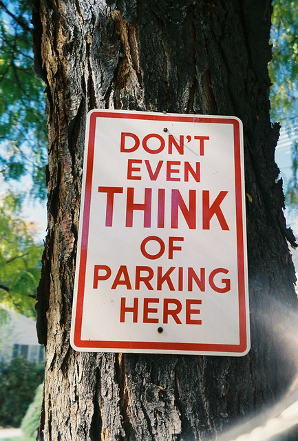
No Parking

Driving for Jesus

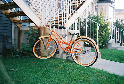
Orange Cruiser

01 November 2010

The Resistance

Jeffery Goldberg's account of the new TSA security pat-down procedures had me gasping with laughter one minute and sputtering with indignation the next. The TSA has introduced more invasive pat-downs for people opting out of their irradiating, genital-imaging full-body scans, primarily, it seems, to induce them to submit to the scanning. All of which, as Goldberg shows elsewhere, is pointless "security theater." You have to give it up for Goldberg. Bluffing your way through TSA security with a fake boarding pass, wearing a Bin Laden t-shirt, just to show how pointless this grossly expensive and personally humiliating system is? Gonzo, man.

31 October 2010

Ditch Witch [Payson 12/52]

Something for Halloween. Sort of.

Ditch Witch [Payson 12/52]

Added by invitation to the Flickr Ditch Witch group on Nov. 9, 2010.

30 October 2010

Drama Queen

Out of 234 posts here to date, only 7 are tagged "humor." I'm not humor challenged, I don't think, though I'm not really a comedy fan either. I find stand-up painful and most sit-coms unwatchable (30 Rock is a glorious exception). I usually like my humor dark, subversive and smart. Then again, Steve Carrell had me in tears during some scenes of Get Smart, and I like Will Smith even in his (many) really bad movies. Maybe my funnybone is just selective.

Or maybe I just feel a bit cheap reblogging "funny videos," which often feel like spam. Probably because they are just spam when they miss, and most funny videos sent to me do miss. I don't want become a humor spammer myself.

Well, I'll take my chances with this one. It's smart and even British. It still may be a cheap reblog, but how can it miss?

29 October 2010

A Dose of Bliss

Bombs from Yemeni terrorists, a looming election catastrophe, Pontiac headed for the guillotine . . . it's all a bit much. Digging around for some soothing music, I ended up listening to some trip hop from more than a decade ago, which in musical terms makes it pretty long in the tooth. But the 90s was bumper season for electronic chill-out music of all sorts. The British made some of the best of it, certainly due to their massive club scene. Trip hop itself is (or was) entirely a British thing.

I find trip hop blissful and dreamy. Some people find it gloomy. Meh, maybe a bit. Make up your own mind. Portishead is probably the best known trip hop artist in the States. Most people have heard at least Glory Box and Sour Times at some point. This live performance completely nails it and has perfect sound. (Long live YouTube!) Massive Attack is, well, massive in Europe, but I only bumped into them last year. "Black Milk" off of Mezzanine features vocals by Elizabeth Fraser of the Cocteau Twins.


27 October 2010

Statins

I went to see my "doctor" (Jay the nurse) the other day to get a prescription renewed (sleeping pills). He has long been hassling me for a copy of my lipid profiles. I get them done every couple years through my job. So I brought them in. My total cholesterol was a bit high at 237. The Mayo Clinic rates 240 as too high; other groups say 200; but in any case, it's not exactly freakout high. But he tut-tutted. "Let's see, you're 42? Well, it's time to get you started on statins." As if it's just what you do at 42.

Jay the nurse is an idiot, always has been, but I go to him because he just gives me my damn prescriptions without major hassles. This, however, really irked me. I'm 42 and in otherwise good health, and he wants to put me on a liver-altering drug with ambiguous benefits, numerous side-effects, and unguessable long-term negative consequences, for the rest of my life.

"No, thanks. I'll lose some more weight." "Won't do any good," he says absently, not looking up. Jay really is an idiot. "No," I say flatly, "I won't take statins." Now he looks up. Awkward pause. "Ok," he says. "Uh, can I listen to your heart?"

He says I have a murmur, previously unnoticed by anyone, oddly enough. Maybe he didn't factor in the anger-fueled adrenaline pumping into it. I'm trying to be worried about that murmur, but I've never noticed it on thirty-mile bike rides or pressing 80-pound dumbbells. I don't feel like I'm about to drop dead. And I'm not taking statins.

Statins lower "bad cholesterol" (LDL), produced in the liver, by altering liver function. They are also anti-inflammatory and do many other things, intended and unintended. There is a string of theories going back to the 50s that high cholesterol causes arteriosclerosis, or heart disease. The theory, which has gone through several incarnations, is clearly not based entirely on science. It's always been a facile answer to a complex question. There is a society of researchers that oppose it entirely [1], and the ever-lucid Gary Taubes explains the basic grounds for skepticism. [2]

But this "lipid hypothesis" gained so much traction that Big Pharma saw enormous profit potential. Statins lower LDL cholesterol, indisputably, and are now the second most commonly prescribed medicine behind psychiatric meds. As a bazillion-dollar profit center, they have been marketed to doctors with unparalleled vigor. And clearly this marketing has been successful. They were first approved for the treatment of heart attack victims with advanced heart disease. Now they are prescribed to healthy 40-somethings. It's been seriously proposed that they be sold with hamburgers, as a sort of antidote to fast food. [3] They'll start putting them in our drinking water any day now.

I'm not giving medical advice here, but am advocating self-education. Google around and you'll see that, whatever Big Pharma may say, statins carry serous risks that are gradually being exposed, including an increased risk of diabetes [4, 4a], testosterone suppression [5], and long-known problems like muscle myopathy, memory loss and other neural issues, liver toxicity (of course), and various bowel and flu-like symptoms. I like this real-world perspective from an Amazon commentator:

    While doctors will tell you they've rarely seen anyone with side effects from statins, among my own circle of middle-aged friends, I know 3 who've had serious problems with their livers, one who had some muscles permanently destroyed, one--a usually energetic tennis player-- who felt, for the few months he took statins, as though he had the flu, and could barely go to work-- and one who was left with ringing in the ears and a facial tic. All of these are listed as side effects of statins, as Kendrick points out. [6]

Compounded with the downsides, the actual benefits are ambiguous. Studies of benefits have been tainted by money, and surveys of studies reveal that while statins may help elderly patients with advanced coronary heart disease (CHD), there is no evidence that all the statins being given to the rest of us, even to people at high risk for CHD, actually reduce mortality at all. [7, 8, 9] And even when helpful, it may be due to statins' anti-inflammatory benefits (like aspirin) rather than its impact on lipids. [10]

Statins are big money for Big Pharma, which spends billions on "physician education" (marketing); in fact, twice as much as it does on research, "US$61,000 in promotion per physician during 2004" ($57.5 billion total). [11] Remember who is educating your physician and make an informed choice for yourself. Heart disease rates are still insanely high, in spite of us gobbling up statins. I think I'll take my chances with an old-school remedy: diet and exercise.

24 October 2010

Toy Cameras

I've had a bit of fun lately with toy cameras, which really are cameras but not usually toys. "Toy camera" is a term of art for simple cameras with a plastic body and lens. Most are cheap and look at least a bit toy-like, but as cult objects some can in fact be quite expensive. Most are film, either 35mm or medium format, though the category of digital toy cameras is becoming better defined and is growing. Google will teach you all you want to know, but see here and here and here. This one was $2 from a goodwill shop and is clearly a toy toy camera.

Pink Eyelash
Still trying to the work up the courage to use this in public.

Toy cameras are very simple point-and-click affairs. They have a fixed focus and no exposure controls. That means you just load them up with fast film, stand back at least four feet or so from a well-lit subject, and trip the shutter. The picture turns out or it doesn't. Amazingly, it usually does. Though it will probably look like it was taken with a toy camera.

Which is the half the fun. Pictures from toy cameras are lo-fi and wonderfully flawed. Poor contrast, softness, distortion, light leaks, and all manner of random weirdness. Some photos are just bad and others are so bad they're good. Just depends on the camera and many unguessable variables. You never really know what you'll get, which is the other half of the fun. It's so cool that they make iPhone apps to simulate it. But accept no substitutes. Using film is part of the experience. Since every shot costs you money, it feels a bit like playing the slots. You only find out how much you lost or won when you pick up your prints from the printer.

Enthusiasts scour second-hand shops for toy cameras. The odd thing is that you will be sorting though a bin of $5 cameras, looking for one that came free with a magazine subscription or with a Malibu Barbie, and tossing aside film point-and-shoots that cost a couple hundred bucks just twenty years ago. I recently pulled one of those out of a bin, too, and will blog the results later. Some of those eighties p&s cameras were engineering marvels. But I find that toy cameras, cameras that take bad pictures by design, are just more interesting.

2Low

23 October 2010

22 October 2010

An Argument for the Obvious

David Pogue of the Times, who I do not much enjoy, nevertheless made an argument for the obvious that is worth reblogging. In fact, everyone should reblog this until software designers get a clue. From Pogue's review of the new Office 2011 for Mac:

    The Mac suite now includes the Ribbon, a horizontal toolbar that’s built into Office for Windows. What I don’t get is this: Last time I checked, computer screens were all wider than they are tall. The last thing you’d want to do is to eat up that limited *vertical* screen space with interface clutter like the Ribbon. Don’t we really want those controls off to the *side,* like as with the Formatting Palette in the previous Mac Office?

In my previous post I mentioned that most computer LCDs now adhere to a squished 16:9 format, mimicking wide-screen TVs. Lots of width, little height. You have to spend big to get a taller 16:10 monitor, $500 or more, and the squarish 4:3 monitors of old are long gone. If you actually use your computer monitor for reading, as more than a few people do, you want a tall screen rather than a wide one. Optimal line width for reading is constrained (traditionally, 66 characters is considered the ideal). Our brains cannot effectively parse long lines. You can't just stretch Word docs or web pages across your massive 1920 screen. If you want more text on screen, you can only go taller. And all computer workers want to read more and scroll less.

Software design has ignored these facts, constantly cramming more and more into the tops and bottoms of our screens. Software and system controls needs to be designed vertically for modern superwide desktops. In this respect, the palette in the previous version of Office for Mac was obvious and brilliant. I've always wished it would find it's way onto the PC. Microsoft has now homogenized the platforms on that account, but in entirely the wrong direction. Oh well. One less reason to feel Mac envy.

21 October 2010

Dizzy

Google gave a graphic shout out to Dizzy Gillespie today on what would have been his 95th birthday (he died in 1993).


I just really discovered jazz about a year ago. After going to a number of concerts and digging into some recordings, I decided it was time to really figure it out. This music that is so compelling but so hard to appreciate. So I watched the Ken Burns documentary (yes, all of it), picked up a couple great books, and started digging into some best-album lists to see which recordings jazz enthusiasts put at the top.

One thing you quickly see is that jazz, from our perspective now, had a brief golden age that produced the preponderance of the top 100 albums. The magic years were from about 1950-65, with it peaking in the late fifties. This music can generally be termed modern jazz, and the varieties developed in the 40s and 50s continue, for all its evolution, to still define jazz today.

The first incarnation of modern jazz was bebop, which changed jazz from dance music (swing) to musicians music. The two main innovators of bebop were Charlie Parker and Dizzy Gillespie. It's because of bebop that jazz today is one of two academic musical genres (the other being classical). It's hard stuff. Hard to listen to and very hard to play. It was created by virtuosos who could not repress themselves, even when people often reacted to their music with shock and dislike. But Gillespie played his music his way his whole life, becoming enormously influential. He is certainly one of the five most important musicians in the history of jazz. The man deserves some respectful thought occasionally, and today was a day for it.

Here's something sweet and cool from Diz.

Dizzy Gillespie Quintet - Tin Tin Deo

True Colors

Anyone who uses a computer ten or more hours a day, like I do, appreciates two things above all else: a good chair and a good monitor. Chairs are easy. Just sell a kidney and buy yourself a Leap. Trust me.

Monitors are harder. Most people just want big and bright, and they want it cheap. The market has responded with a flood of 21.5" to 24" 1920x1080 ("full HD") LCDs. You can buy them any day of the week starting at $170 or less.

But LCD technology is not monolithic. All LCD monitors use the same basic technology, called TFT, but there are various subtypes. At work I use a 5 year-old Dell 2405FPW 24" LCD that has a PVA panel. When introduced, it was probably about $1200.

PVA technology is still used on some high-end monitors. Rather than the now-prevalent 1920x1080 (16:9 ratio), it is sized at 1920x1200 (16:10 ratio). This extra height makes two-page reading much more enjoyable. My old Dell also displays color at full 8-bit color depth (16,777,216 colors).

But all of the big, cheap LCD monitors you see today are based on TN panels. They are at most only 1920x1080, which is fine for movies but lousy for on-screen reading. I personally use my monitor more for reading than movies, but "Great for Reading!" is apparently an unconvincing marketing point.

TN panels are bright and fast, as well as cheap, but they achieve this by compromise: they only display 6-bit color (262,144 colors). They then "simulate" the full 8-bit color gamut with various dithering techniques, which compared side-by-side with true 8-bit color are immediately seen as unconvincing. They also have little stand adjustability, poor viewing angles, uneven backlighting, poor blacks, color casting, clouding and other problems. My cheap Acer monitor at home has all these problems at once.

The best monitors today use IPS panels. All IPS monitors are 8-bit true color (or higher) and have wide viewing angles. They also tend to have much better backlighting and, well, better everything. IPS monitors used to be much more expensive than TN, starting around $500. New IPS technology (e-IPS) has brought down the cost of entry-level IPS monitors dramatically, starting under $250. You still get more when you pay more (wider gamut, better performance, 1920x1200 or higher), but reviews of entry-level models have been positive.

In a post the other week I included a flower photo I made with a Canon EOS-1Ds MkII. It looked wonderful on my 8-bit work monitor, with perfect detail and great color. On my craptastic 6-bit monitor at home, though, the colors were smeared and garish, and some fine details obliterated.


Photographers spend big on great monitors. It's vital to both the
enjoyment of photography and the production of great photos. I'll never settle again for a cheap TN monitor. True color is a must.

19 October 2010

15 October 2010

The New Gap Logo

So Gap has . . . well, had a new logo. For about a week. In case you missed it in the news:


Public flogging has rarely been so entertaining. The new logo appeared on Oct. 4, and the instantaneous and universal mockery of it probably had the designers cleaning out their desks that same day. It would take a dissertation to map the full dimensions of the response.

The site craplogo.me went up straight away, turning whatever text you like into a version of the new logo. A faux Twitter account was created for the logo to explain itself ("The blue square is a scratch-n-sniff"). Eloquent descriptions of its utter failure flooded design and advertising sites. "[It's like] that awkward cap-sleeved tee with the rhinestone letters you find while thrift shopping that’s neither vintage nor new, but definitely not cool.” [1] An interview with the new logo probed its feelings: "The only way to deal with the pain is comfort eating. Pretty soon I'll be type set in Helvetica Neue Black." [2] Deconstructions of the public outcry are appearing. [3] Vanity Fair posted an obit: "The logo passed after a brief and ignominious battle with stage IV banality." [4]

I agree that the design totally blows. With the typeface they chose (Helvetica 75 Bold), placed next to a blue superset window, it reminds me of the the startup screen for Windows XP. I've lost many hours staring at that screen, and I hate it. Anyway, there is nothing interesting about the new logo. It looks undesigned. The blog iso50 has a thread with over 300 user-submitted designs. Subtracting a few that are intended purely as comic, almost every one is better than the new logo. And these were just tossed out.


What went wrong? The amount spent on the redesign was probably staggering. Perhaps millions. That was certainly the heart of the problem. There was no room in this for individual creativity and genius. It was thoroughly a committee product. And some senior decider, a non-designer, was probably really fond of that Windows XP logo. Probably Gap NA president Marka Hansen. [5] I guarantee that person still has their job. The suits never take the fall.

The passion of the public outcry shows what ownership the public feels for corporate branding. We are a consumer society. We co-opt corporate identity as our own identity. If I wear Gap chinos, that logo is my logo, too. And the chino-wearing public has spoken: Hands off my logo.

14 October 2010

Blahg Post

I have the blogging blahs. Mostly due to mental fatigue, and otherwise due to the futility of trying to blog anything that at least 1,436 other bloggers, at that very moment, are not also blogging. There is nothing new under the sun, just endless recombinations.

So I'm just going to blog a few other blogs that I wish were mine. They deal with photography. Naturally. But otherwise, their virtue lies in their narrow topical focus. The essence of art is relentless topicality. Too tired to say much, but here's a half-dozen.

1. 5b4 - A blog on photobooks by a connoisseur's connoisseur. Brilliant books, most of them way off the beaten path, and exceptionally well reviewed.

2. Shorpy - This site posts a new hi-res scan of a historic photographic plate daily. I time-trip on it every single day, and the photography is usually technically impressive. Very impressive. We've now mastered color, but otherwise you quickly learn from Shorpy that still photography reached its technical crescendo a full century ago.

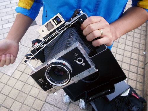
3. tokyo camera style - Nothing but photos of (mostly classic) film cameras that the blogger spots on the streets of Japan. The Japanese love their cameras. I'm staggered by the classics and exotica this guy finds everywhere in common use. Anyone for, say, a pristine Polaroid press camera?


4. Unhappy Hipsters - Another blog that proves every possible subject already has a blog dedicated to it. This one is a subversive critique of the contempory (well, 80 year-old) fetish for the minimalist aesthetic. I'm personally smitten with both minimalism and hipsterism, so this site leaves me rolling. See this post for a keen commentary on it from a photographer's perspective.

5. Prison Photography - This site is as titled: a blog about the photography of prisons. But its purpose, otherwise, is to shine a bright light on the need for prison and sentencing reform. A sustained visual meditation on the socially invisible practice of incarceration.

6. The Photography Post - A live feed aggregator for over 100 of the very smartest photography sites on the Web. Two of the preceding sites (5b4 and Prison Photography) are covered. I've only sampled a few others there so far, but they have been similarly impressive. This is a note to self: go and browse with high intent. An impressive resource.

09 October 2010

05 October 2010

Test Driving a $10,000 Camera

My job in times past has sometimes involved document photography, for which we've used various high-end commercial and professional cameras. I've never used this gear myself. I'm a project supervisor, not a technician. We no longer do this kind of work ourselves, but a pile of our old gear is temporarily parked in my office. Looking at it the other day, I realized I've never pulled any of it out for a test drive. And since it's the nicest equipment I'll probably ever touch, it suddenly seemed irresistible to take it for a spin while I had the chance.

The best digital camera we have is a Canon EOS-1Ds MkII. The 1Ds is Canon's flagship model, though the MkII version is a generation old. Its dinky 2" LCD tells its age, but it's still a thoroughbred and built for serious combat. With a beefy Canon 28-70mm f/2.8L lens on it, it weighs almost six pounds.  I was really starting to notice the weight after just 30min. But I would expect it to contain a bit of metal. The camera cost $8000 new and the lens about $1200. Just the filter on the front cost more than the last compact camera I purchased.


So what's it like using a $10,000 camera? Not so simple. It took me 15min just to figure out how to run it. Three screens, lots of buttons, a single dial (no knobs), and menuing that is completely unlike other Canon DSLRs. I shamefully had to consult the manual.

But shooting with it was a lot of fun. The first time I held it up to my eye was a revelation. The viewfinder is the biggest and brightest of any Canon. Compared to a Rebel-class viewfinder, this baby is IMAX. And then I pushed the shutter, and jumped with surprise. The shutter response is crisp and instantaneous, and sounds amazing. If this were a car, that shutter sound would be the throaty snarl of a Ferrari V12.

The 1Ds MkII has a 16mp full-frame sensor, which means that unlike most DSLRs, there is no crop factor for 35mm lenses. This also demands more of the lens. I was surprised to find that even with this premium L-series lens there was vignetting in the corners when shot wide open at 28mm. The filter may be a bit to blame, though this is a known problem with this lens on this camera. The 1Ds simply demands more of the lens than the film cameras it was originally designed for.

One big upside of a full-frame camera is you have a shallow depth of field that both gives you more creative options and imparts what has come to be regarded as "that pro look" (since compacts can't do it). This lens allows close focus to about 1.5ft, at all focal lengths, which for a non-macro lens is very good. It lets you do this (random desk shot, sorry):


This lens produces fantastic color and contrast, especially for a zoom. I am not a flower photographer, but flowers were what I had to photograph nearby. And I have to admit, the light was perfect and the results beguiled me. My only disappointment is how easy it was to get commercial-quality images with such a great camera and lens. Even just 10 years ago pros were sweating at their craft with fussy Hasselblads and Fuji Velvia slide film to produce work that, in technical terms, was inferior to what a rank amateur like me could get 20 minutes after picking up this camera for the first time.

02 October 2010

26 September 2010

23 September 2010

Kindle in the House

In an interesting turnabout, Tani has become the new technophile in our house. First she bought a new Zune HD, then a very swish new computer, and this past week she got herself a Kindle. As for me, I mostly listen to an old hand-me-down ipod nano, my computer is an ugly beige retro-tower from the 90s, and I'm buying and reading more old-fashioned tree-based books than I have for years.

And honestly, I don't want a Kindle. No interest at all. First, I'm no longer willing to pay just to read something. I read on the internet for free constantly. I read books at my university for free constantly. So I've become unwilling to pay for words just to read them. Words are so plentiful and cheap that I can no longer see in them any economic value. And in fact, there is almost nothing I could possibly purchase on the Kindle that I could not get for free by other means. I see Kindle book purchases as the buying of a convenience, and for a mere convenience, the price per unit is far too high.

My second issue with the Kindle is that I read from a screen continuously. I spend more time "interacting" with words on a screen than I do with human beings by a ratio of probably 10 to 1. That's a conservative guess, and I'm really not joking. And I regard it as a sterile and numbing activity, an activity demanded by necessity. If I could sustain employment and feed my interests through purely analog means, that would be my strong preference. But books are just too inefficient to fill most informational needs. I'm surrounded by several hundred books in my office all day every day, and rarely is one taken off the shelf. Internet resources have long surpassed their academic utility, and that makes me very sad.

My need for analog is one reason why I've been buying paper books lately. No surprise, mostly I buy and read books of photography or on photography. As I've written (here, here, here), the printing of photographic images has reached such a peak of high art that it can now approximate a photographic print. Viewing such books is an intensely aesthetic experience and, by extension, owning them feels like collecting art. It is collecting art, but very often at pulp paperback prices. I still don't know how, economically, one can buy a $50 coffee-table book, new in shrinkwrap, for $5. But it thrills me.

Most surprising to me is that I now find my experience of reading an analog book much more immersive than I ever remember it being. Maybe I've just forgotten, or maybe I'm at a different place in life. It's not just that I lose myself more completely in the book. I swear I feel a more intense connection to the content, the characters, the ideas than I do when reading on screen. Books and LCDs convey information equally well, but I find I have a relationship with print that I do not have with pixels.

Maybe I am just an analog man, but I think there is something more universal to it. There is an impressive revival in vinyl record sales, now at their highest point in 20 years. Even tape cassettes are coming back. Film photography is not only surviving, but is rebounding in some segments. Kodak even just released a new film emulsion. This is not being driven by oldsters, but youngsters, who are rediscovering the joy of analog. The limits of analog are seen as creative constraints and lovable idiosyncrasies. Analog's defects, often inherent in its materiality, also make it personable, something capable of being loved.

Producer and artist Brian Eno touched on the reason for this in an article some years ago in Wired. He is speaking specifically of artistic tools, but the principles here are more general:

    With tools, we crave intimacy. This appetite for emotional resonance explains why users - when given a choice - prefer deep rapport over endless options. You can't have a relationship with a device whose limits are unknown to you, because without limits it keeps becoming something else. . . .
    This is the revenge of traditional media. Even the "weaknesses" or the limits of these tools become part of the vocabulary of culture. I'm thinking of such stuff as Marshall guitar amps and black-and-white film - what was once thought most undesirable about these tools became their cherished trademark.
    Since so much of our experience is mediated in some way or another, we have deep sensitivities to the signatures of different media. Artists play with these sensitivities, digesting the new and shifting the old. In the end, the characteristic forms of a tool's or medium's distortion, of its weakness and limitations, become sources of emotional meaning and intimacy.
    Although designers continue to dream of "transparency" - technologies that just do their job without making their presence felt - both creators and audiences actually like technologies with "personality." A personality is something with which you can have a relationship. Which is why people return to pencils, violins, and the same three guitar chords.

21 September 2010

Pepper Run

The trunk of our car. This is how dissertations get written. Well, being Mormon, how mine is getting written. Everyone else uses gallons of coffee. The pillow and blanket? For crashing on the floor of my office when the caffeine doesn't work.

Who would want to do this?


[Revision of a much less coherent post written at 3:00AM. Sorry about that.]

18 September 2010

American Mutton [Payson 6/52]

I saw this sheep randomly grazing lawns on Main St. in Elberta (pop. 278) as I was driving through last week. The whole town is a little American Gothic. The wandering lambmower honestly didn't look too out of place. It may in fact be employed by the city to trim the verge. I did mention this was Elberta.

American Mutton [Payson 6/52]

11 September 2010

Aspen Stand [Payson 5/52]

Tani and I drove to the top of the scenic byway above our house one evening last week, just for some high mountain air. We rarely do it. The sun was very low, setting on the aspens. We talked about retirement.

Aspen Stand [Payson 5/52]

08 September 2010

6x6 Chromes

Film has of course been almost entirely replaced by digital. I own a half-dozen 35mm film cameras and have doubted I will ever use them again. For a while I thought it would be fun to set up a wet darkroom to develop and print b&w film. But although developing film is easy, darkroom printing is a difficult and mysterious art. Lifetimes are spent mastering the craft. And every experiment costs you money. This is why most people who still shoot film scan it and print digitally. Easier, cheaper, and generally better results. And even a shoot-to-scan workflow makes little sense, unless you are going after a certain film look, since it's a major expense and hassle. Sheesh, just shoot digital and be done.

But lately I've been looking at film from another perspective, valuing a different outcome. Most film uses a negative emulsion (whence, "negatives"), with reversed colors and tones. They are "unreversed" when enlarged and made into prints. Most film is negative film because it's easy to shoot (wide exposure tolerances) and easy/cheap to print.

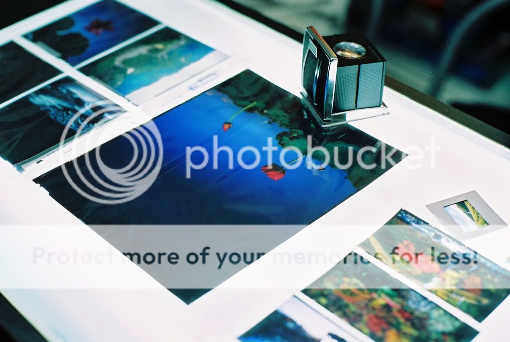
But there is also positive, or transparency film. Transparencies are also sometimes called slides or chromes (from Kodachrome). These are not normally made to print but to project or scan. Set on a lightbox, they kind of look like luminous little prints but differ from prints in two respects. The resolution of the image is much, much higher, with very dense and fine detail. And also, because the image is projected with transmitted light (through the back) rather than using reflected light (like a print), colors and tones are much more vivid and the light in the picture looks luscious and syrupy. A lot of photographers regard chromes, even apart from the images they reproduce, as art objects.


6x6 chrome of a 35mm chrome

Some artists have taken transparencies to the next level by producing huge, even life-size transparencies, which they mount on light boxes for display. The first and most famous "luminist" is Jeff Wall, who started doing it in the late 70s. At the time it must have blown viewers away, and still they are very impressive. But today we're probably a little jaded to the beauty of transparencies because we're very used to viewing transmitted-light images. That's what computer monitors produce, even if at a fraction the resolution of chromes.


From left: 4x5, 8x10, 35mm (upper right), 6x12cm (?) (lower right)

Most people my age (40+) have probably seen 35mm film slides and I doubt it took your breath away. Too small. But I've seen large format 8"x10" transparencies, and they are stunning. Unfortunately, they take a giant view camera to expose and each exposure will cost you about $20 in film and developing. 4"x5" transparencies are also pretty impressive, but still cost about $6-7 a shot.

But medium format 6x6cm film isn't so bad, about $1.80 a shot. I could almost afford that, and I think the transparencies are just large enough to enjoy even without a magnifying loupe. 6x6 film is about 3.6x larger than 35mm. Still a bit smallish, but far less squinting required.

Slide madness
6x6 chromes

As I said, I have a number of 35mm cameras, but also one medium format, a Mamiya C3. It's a massive twin lens reflex (TLR) camera that my dad gave me. All TLRs are substantial, but this one's a real brick. If you drop it, don't worry about the camera, but look out for your toes. I've never used it, but I'm sure dad paid quite a lot for it, back in the day. I think it will need a service before it is ready for action, but it will certainly shoot 6x6 chromes just fine.

But $100 for the service, $30 for a cheapo light meter, then film and developing. Yeah, that first roll won't be cheap.

05 September 2010

Towers [Payson 4/52]

Coming home just as the sun was dropping behind West Mountain, I dove off the highway and cast about for anything worth shooting. I tried for the water treatment plant, but no good angles. So I turned around and started working some industrial towers. Geneva Rock and Concrete, I think. Three minutes of light left. Any light. Some quick clicks.

When I got them into PhotoShop, I thought I had nothing. Then I went a bit medieval on contrast and tone curves and hues, noise layer added to fight banding, and, surprisingly, out came something I liked. The weather towers at center, up on West Mountain, really cannot be seen in the straight photo, but in silhouette they are pronounced and important to the picture. So in it goes at week 4.

Towers [Payson 4/52]

01 September 2010

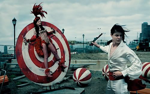
The White Stripes

Most music criticism employs an absurd amount of comparison. So band X is "picking up the Minutemen math-punk thread" but with "screaming MC5 guitars," but can also sound "like a Krautrock Soft Machine" or even "Devendra Banhart piloting Little Feat." (From an actual review.) I'm not going to pretend I'll avoid this. That would be a practical impossibility, because comparison is vital to description. But I want here to start with a band that, for me, is a rock reference point so pure it almost abolishes prior art.

I first heard the White Stripes about five years ago, four albums into their career. I was just getting back into rock after a hiatus. I'd never gotten past the death of grunge or seriously listened to any rock post-Soundgarden. And being old, I didn't have friends exposing me to anything new. I don't recall how I even came across the White Stripes, but I put on their first album, and when it started into "Jimmy the Exploder," I felt like I was just hearing rock 'n roll for the first time. But that sounds quaint. Let me rephrase: It slagged my brain and I've never recovered.


The White Stripes - Jimmy the Exploder

The first two White Stripes albums (The White Stripes and De Stijl) sound like some impossibly successful sound lab experiment to reduce rock to its purest essence. Not in the sense of purely formulaic—it's actually really quirky—but pure in its effects. Those albums communicate to me the raw electricity that rock should communicate. The first one is certainly the purest, and Jack White apparently thinks as much, too: "I still feel we've never topped our first album. It's the most raw, the most powerful, and the most Detroit-sounding record we've made." Subsequent albums are good, but on the whole, decreasingly good. The problem is you can't get purer than pure.


The White Stripes is a two-piece drum and guitar duo, Jack and Meg White. (Apparently once married, though they deny it.) Meg pounds out time on her large tom with ferocious concentration, and Jack lays down raw guitar and vocals over the top. Jack White's influences are Dylan, the Stones, punk, country, and who knows what else, but he's first of all a blues-rock guitarist. Quoth Jack, "I wouldn't trust anyone who didn't love Led Zeppelin." But he's also a devotee of original Delta and Detroit blues, especially Son House, whom he covers with "Death Letter" (on De Stijl), the most electrifying blues track I've ever heard.


I think Jack White is a musical genius. That means at his best there is none better, but also that he is highly restless and erratic. His more recent ensemble experiments with the Raconteurs and the Dead Weather are not especially good. The Raconteurs made a lot of sense, really. Combine Jack White with the superb Greenhornes and you should have jam on toast. But the sum is clearly not equal to its parts.

The White Stripes are often called "garage rock" because of their raw, lo-fi sound, and they became the engine of a garage rock revival centered on Detroit. But I'd call them primal rock, what rock sounds like when it's all talent and instinct and energy, and no production. A lot of rock bands go for that sound, of course, but few succeed. There is no formula here, just eccentric genius. That rare spark was brilliantly visualized by an equally eccentric genius, French director Michel Gondry, who directed the video for "Hardest Button to Button." Best. Video. Ever. (Though you may need Dramamine.)


Bonus content: The Making of.

30 August 2010

No Dead Tree Edition for OED3

I was told by a colleague that OUP is pulling the plug on print dictionaries, but this will even include their flagship, the Oxford English Dictionary. “The print dictionary market is just disappearing, it is falling away by tens of per cent a year." So OED3 will probably not appear in print. Unless it is shown that iPads and Kindles cause brain cancer and print books make an unexpected comeback.

But Simon Winchester, renowned specialist on professors and madmen (great book), thinks that unlikely, and calls the online-only edition "prescient":
    Until six months ago I was clinging to the idea that printed books would likely last for ever. Since the arrival of the iPad I am now wholly convinced otherwise.

    The printed book is about to vanish at extraordinary speed. I have two complete OEDs, but never consult them – I use the online OED five or six times daily. The same with many of my reference books – and soon with most.

    Books are about to vanish; reading is about to expand as a pastime; these are inescapable realities.

29 August 2010

Music

I find myself challenged by the very nature of music. I think most people, especially past a certain age, are only casual music listeners. Radio people. Me, I rarely listen to the radio, because most music does nothing for me. In fact, I actively dislike most music. But when I hear music I really like, my brain spasms with a flood of endorphins. Like mainlining pure pleasure. It's literally a religious experience, and I don't know why. That this happens with such wide varieties and genres of music deepens the mystery.

I don't know exactly what makes good music good, but some genres I understand better than others. With mainstream country music, it's the sentimental lyrics and simple sing-a-long melodies. It's done strictly to a formula and the formula works. In fact, as Steve Leftridge has brilliantly argued, it's exactly the same successful formula as classic rock. Alt Country (at least the hard-edged Bloodshot kind) does the same thing, but replaces the sentimentality with punk attitude.

Jazz is all about constant motion, waves of chromatic tones over a highly syncopated rhythm, with an emphasis on free-flowing melody rather than chordal harmony. An instrumental soloist usually leads instead of a vocalist. It's the antithesis of post-40s popular music, which is why most of us can only enjoy it in certain moods and small doses. We're just not acculturated to it.

Classical music is just archaic. I can understand why people don't like it (archaic), but I really don't know why some people do. But there is a profile. Most classical music fans either have played an orchestral instrument, have a lot money, are stereophiles, or are old. Or all of those things.

Rock is simple on paper. Strong backbeat, 4/4 time, drum 'n bass 'n guitar(s), a basic verse/chorus structure, vocals and harmony, and lots of youthful and/or counter-cultural attitude. I mostly listen to rock, so I'm a rock fan, but most rock I hate. Especially when it conforms to the classic rock formula. With some exceptions, the more "rock" it is, the less I like it. Why is that?

The fact is, unlike jazz or country, straight genre rock exhausts the formula very quickly. This is why most rock does not fit the classical rock mold in one way or another, which broadens the scope of the term's meaning until it's almost meaningless. Rock is some kind of consensual genre that no formula can actually define. If I say, "I like rock," that could mean I like REM or Limp Bizkit or the Beatles or AC/DC. All superstar bands, but few rock fans like them all equally, or even like them at all. Whereas few jazz fans love Miles but hate Coltrane.

The fact is, rock music in the round is a highly varied and complex musical form. There is a bewildering number of subgenres, that some artists are quite happy to skip across, and it's always both self-referencing and appropriating influences from the outside. It's a connoisseur's music every bit as much as jazz. For these reasons rock is always surprising me, usually when I've all but given up on it, but finding rock I really like is an incredible challenge. Thirty seconds on Flikr and I can find photographs that thrill me. But I can spend hours reading on Pitchfork and surfing Zune, and still come up with zilch.

This ramble is actually a preamble (pre-ramble?) to some music posts I'm going to start doing, highlighting some bands, or genres, or subgenres, or whatever, that have caught my fancy. Not reviews so much as notices and appreciations. For some reason, I find music criticism the most worthless kind of criticism. I can read a couple movie reviews and know with fair accuracy if I will like a certain movie. But I can read several album reviews and have no idea if I will like an artist or album at all.

I guess (as they say) writing about music is like dancing about architecture, but blogs are read, not heard. Sorry. Right now, it's either that, or all photography all the time.

28 August 2010

Forgotten Shoes [Payson 3/52]

There are some ABCs painted on the a bike path next to a playground by my house. I was riding by and saw these shoes left carefully in the hollow of the A, no children anywhere in sight. It struck me as a wonderful bit of found art (click!) representing childhood's little misunderstood dramas. The drama occurred with the owner's mother when she went home shoeless. But for her this was the most visually appropriate place to leave her shoes, while she ran in the grass or played in the creek. She could not have been more correct.

Forgotten Shoes [Payson 3/52]

Addendum: This photo was invited to be added to the Flickr group Lost shoes (baby or children). My first invitation! And I think the very existence of this group proves my theory that if you can imagine it, there is a group for it on Flickr.

25 August 2010

Neurotypical Envy

(Warning, this an unusually personal post . . .)

I heard a feature on NPR driving home the other day about an autistic woman named Lisa Daxer, who blogs at Reports from a Resident Alien. She discusses both in the NPR story and extensively on her blog the differences between neurotypicals and people with autism and similar handicaps. She describes her autistic self as having "a weird brain." A neurotypical (her own great term) is "anyone who doesn't have a weird brain, someone in the middle of the neurological bell curve." Her atypicality is multiplex, but most challenging is her lack of social ability. She doesn't understand other people. Her brain is just wired differently. This isn't a lack of "social skills," something the study of Dale Carnegie and Miss Manners can correct. It's a lack of neurological capacity.

I really appreciated this young woman's honesty and advocacy. I'm not autistic, but I'm certainly not a neurotypical. I suffer from social anxiety and other neuroses that have defined my life, but which I've only come to recognize as neuroses quite late. Better late than never, but I'm still stunned that it took forty years for me to recognize that my challenging personality structure was something other than just a result of moral or religious failing.

Social anxiety, for me, is not shyness or social ineptness. I can be charming, if I need to, can even light up a party, if I need to. I just feel little need to. I'm not antisocial; I'm nonsocial.

But at the root of it, in fact, is anxiety. I find conversation to be full of potential conflict, embarrassment and shame, none of which I process well. I find social expectations a burden. Most conversations, sometimes even with people very close to me, seem like a walk through a minefield. I also handle stress poorly but project it regrettably well, which is (or I imagine it to be) a drain on those close to me, which in turn prompts me to withdraw when a neurotypical would be looking for social comfort. And when other people are stressed, well, I withdraw then, too.

Even casual social interactions are challenging. I'd rather take a fork in the eye than spend two hours making polite conversation at some work or church function. It seems like meaningless suffering.

Neurotypicals find conversation and socialization as natural as breathing. As Lisa Daxer says, "By default, they socialize. You have to actually interfere to stop neurotypicals from socializing." I find that incredible. I'll continue to challenge my anxiety, but I very much doubt I will ever have the neurotypical experience of compulsive and effortless socialization.

And I admit to being a bit jealous of that. Neurotypicals have super magical powers of sociability that are completely invisible to them, even though that sociability enables them to have a plurality of healthy relationships and take social risks that are personally and economically empowering. Their sociability defines their lives as much as my lack of it defines mine. They just have no idea.

But of course, my lack is only revealed by their abundance in numbers. If the bell curve were shaped differently, I'd be the neurotypical and they'd be struggling with the burden of hypersociality. O cruel averages.

23 August 2010

Weegee the Famous

The girls are in New York City right now, so naturally I am thinking about Weegee, the most famous crime photographer of all time (wikipedia). He worked the New York crime beat in the 30s and 40s, publishing in 1945 his first book, Naked City, which became the basis for a famous noir murder mystery film of the same name. Afterward he went to work himself in Hollywood, as a photographer, actor, and inspiration for all future stereotypes of cigar-chomping news photographers.


Weegee (Arthur Fellig), Their First Murder (October 9, 1941)

A few gems on Weegee: The NY Times published this great little article on him in 2008. Fantastic five-minute read. A kind soul has also put up an mp3 of Weegee himself talking about his work from a 1958 record called, Famous Photographers Tell How. A number of books on Weegee have been published, mostly of his photography, but a few recent works also have great essays on the photographer himself. Two not-to-be-missed titles are Weegee's World (1997) and Unknown Weegee (2006)

Finally, here is a feature on Weegee that was published in the April 12, 1937, issue of Life Magazine (as always, click to enlarge). The trunk murder lead is typical of Life at this early date, under managing editor John Billings, who personally did all photo selection and layout, and who wanted his magazine to really grab readers. He was not averse to (for the time) rather racy and shocking content. But I'll post more about Life another day.


21 August 2010

18 August 2010

Artworld vs. Realworld

Lately I've done a little reading on art theory and art criticism as it relates to modern photography. Perhaps the best book I've read so far is Charlotte Cotton's The Photograph as Contemporary Art. I've been fascinated to find that most contemporary art photography is, as one recent blogger summarized it, "theoretically-driven conceptual photography." I'm speaking here of that contemporary photography favored by galleries, museums and academics. In other words, the artworld. In fact, to distinguish it from other forms of non-commercial or artistic photography, I'm going to label it simply artworld photography.


As artworld photography goes, this is straightforward. No, really.

Artworld photography is a genre of photography most people never see, even in photography magazines, and when they do get dragged into a gallery to look at it, they have no idea why it's on display. Great swaths of it are driven by postmodern theory, which challenges traditional ideas of authorship and meaning a variety of ways. The net product is photography that, counterintuitively, "relies most heavily on words, whether to explain or obfuscate its meaning." It's photo-illustration, or visual performance, illustrating various artistically fashionable political or theoretical ideas. It is a theoretical exercise rather than the aesthetic or documentary exercise most people assume photographs to be.


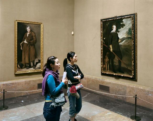
Part of a gallery series by Thomas Struth. This is more challenging artworld fare, but typical. It is not visually interesting in any obvious way and its meaning is esoteric. Artworld art.

For these reasons, it seems few artworld photographers succeed as artworld photographers on the visual strength of their photographs alone. They invariably offer up explanatory narratives for their work that are heavy in theory and couched in the lingo of artworld in order to impart artistic meaning to their work. Or more precisely, using Arthur Danto's terms, to legitimate their work as a candidate for artistic appreciation. In fact, I expect it would be very difficult to break into the artworld with your photographs if you could not explain their value in artworld terms. Or at the very least, you must attract critics and curators (like Szarkowski) who do that for you.

Realworld photography is basically everything else. It's primarily committed to what artworlders would call a "straight" aesthetic, but it's realworld because it is democratic. You don't have to belong to a guild just to have an opinion on a photograph, as in artworld. There, first you need a certain status or credentials; then you must demonstrate an informed understanding of the photograph; then you have the right to an opinion. In realworld, you just like the damn picture or not. Democratic.


"Funeral - St. Helena, South Carolina " (1955), from Robert Frank's book, The Americans. Realworld art.

Sure, it goes deeper than that. In realworld we have our guilds or, better, clubs. You can become a connoisseur or a collector or blogger or a film fetishist and, very often, you are a photographer yourself. There is a history of the art you learn and become a part of yourself. There are of course cultural, political and historical frameworks for critical judgments. It can be as challenging as anything in artworld. But in realworld a great photograph can just be a great photograph, without having to be overtly transgressive, political, or encoded with a theoretical narrative.

Most photographers are, in fact, realworld photographers. They revere the masters of the "straight" aesthetic that became dominant about a century ago and they still work in strong dialogue with that aesthetic. They take seriously the unique qualities and genius of the medium. They regard photography as an artistic end, not as an artistic means. I'm definitely a realword partisan.

Now, I do confess, I enjoy at least some artworld photography. My biggest objection to much of it is that it is esoteric and pretentiously didactic. I find myself working hard to extract meanings that do not interest me. But I find more compelling that generous portion of photography that straddles the lines. I enjoy the democratic work of someone like Platon, whose portraits are definitely realworld, even fashion, but still is tapped for gallery shows. I guess he gets it all.