I love vintage photography from the 30s-60s and especially when shot on the lately deceased color film Kodachrome. And when it comes to great looking classic Kodachrome, the greatest single public trove must certainly be the FSA/OWI Color Photographs internet archive of the Library of Congress. It includes 1,600 color transparencies that were taken to document the domestic war effort during World War II. The FSA/OWI Black-and-White Negatives internet archive contains Depression-era photographs from photographers like Dorothea Lange and Walker Evans. The historical, art historical and aesthetic importance of these b&w photos is tremendous. All of these can be freely downloaded as high-resolution TIFFs.
But today I want to highlight the color archive. The entire collection can be easily browsed and enjoyed on LOC's Flikr photostream in a set titled 1930s-40s in Color. The only downside is that the Flikr images are rather small and the color is not very impressive. The scans are very conservative, unsharpened, and lack the saturation that they really should have. A little tweaking in Photoshop they really come alive. I've downloaded about 30 of the original TIFFs and tried to restore them to somewhat of their full glory. On a good computer screen, this is probably close to what the original transparencies would look like sitting on a light box.
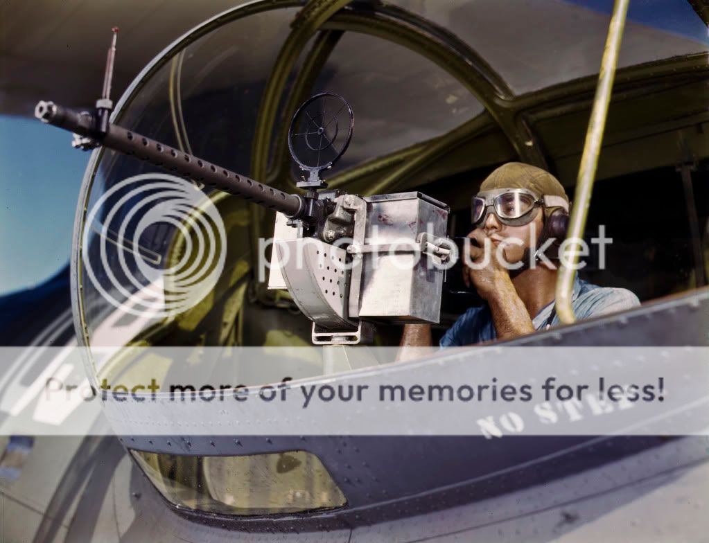
Corpus Christi, August 1942 [click to enlarge]
A generous number of these photos, color corrected and in high resolution, may also be found under the tag 4x5 Kodachromes on the vintage photo site Shorpy. This is a beautiful example:

Kodachrome Goes to War: 1942
I just get lost in the gorgeous reds, yellows and blues of Kodachrome. Skin tones are slightly ruddy and very healthy. I regret that these colors belong to a different era. The supersaturation of so many modern color photos looks almost neon in comparison. Modern color curves are more in the lineage of Fujifilm Velvia transparency film, which stole Kodachrome's crown in the 1990s as color film of choice among landscape, nature and many other genres of (non-portrait) color photography. Our modern eyes now see Kodachrome colors as dated. We want everything to have that modern saturated pop found in nature calendars and lipstick ads.

Flowers dressed up in the colors of Fujifilm Velvia 100F
To a lot of us, Velvia colors look a bit 90s. Of course, now in the Photoshop era you can curve out your colors to look any way you like, and I think this is reintroducing a huge variety of palattes to modern eyes. In Photoshop you can even emulate all the different color films of times past. Many photographers, at least for art photography, develop their own color signature, and a retro twist is far from unusual. A Martin Parr photo always has those Martin Parr colors.

Back to Kodachrome at War. What makes these chromes spectacular, apart from the color, is that most are 4x5 inch transparencies, which are about 16x larger than 35mm film. They hold a lot of detail. The original 150mb scans are about 50 megapixels in size. At just 25% they fill up my 24" monitor. You're not just looking at someone in an old photo. It's like inviting them right into the room.

You're not forgotten, Rosie!
Addendum: There is a published book of the FSA/OWI color photographs: Bound for Glory: America in Color, 1939-43 (New York: H.N. Abrams, 2004). You can get a used copy on Amazon, though I think it's a bit pricey. But the two essays it contains are really worth reading and point to some other publications about this archive. The photo reproductions are good, but favor FSA photos over OWI. Many of the former are from 35mm slides and really suffer next to reproductions from larger formats. And I can honestly say that these images look more spectacular online than in print. Sorry, print.
But today I want to highlight the color archive. The entire collection can be easily browsed and enjoyed on LOC's Flikr photostream in a set titled 1930s-40s in Color. The only downside is that the Flikr images are rather small and the color is not very impressive. The scans are very conservative, unsharpened, and lack the saturation that they really should have. A little tweaking in Photoshop they really come alive. I've downloaded about 30 of the original TIFFs and tried to restore them to somewhat of their full glory. On a good computer screen, this is probably close to what the original transparencies would look like sitting on a light box.
Corpus Christi, August 1942 [click to enlarge]
A generous number of these photos, color corrected and in high resolution, may also be found under the tag 4x5 Kodachromes on the vintage photo site Shorpy. This is a beautiful example:
Kodachrome Goes to War: 1942
I just get lost in the gorgeous reds, yellows and blues of Kodachrome. Skin tones are slightly ruddy and very healthy. I regret that these colors belong to a different era. The supersaturation of so many modern color photos looks almost neon in comparison. Modern color curves are more in the lineage of Fujifilm Velvia transparency film, which stole Kodachrome's crown in the 1990s as color film of choice among landscape, nature and many other genres of (non-portrait) color photography. Our modern eyes now see Kodachrome colors as dated. We want everything to have that modern saturated pop found in nature calendars and lipstick ads.
Flowers dressed up in the colors of Fujifilm Velvia 100F
To a lot of us, Velvia colors look a bit 90s. Of course, now in the Photoshop era you can curve out your colors to look any way you like, and I think this is reintroducing a huge variety of palattes to modern eyes. In Photoshop you can even emulate all the different color films of times past. Many photographers, at least for art photography, develop their own color signature, and a retro twist is far from unusual. A Martin Parr photo always has those Martin Parr colors.
Back to Kodachrome at War. What makes these chromes spectacular, apart from the color, is that most are 4x5 inch transparencies, which are about 16x larger than 35mm film. They hold a lot of detail. The original 150mb scans are about 50 megapixels in size. At just 25% they fill up my 24" monitor. You're not just looking at someone in an old photo. It's like inviting them right into the room.
You're not forgotten, Rosie!
Addendum: There is a published book of the FSA/OWI color photographs: Bound for Glory: America in Color, 1939-43 (New York: H.N. Abrams, 2004). You can get a used copy on Amazon, though I think it's a bit pricey. But the two essays it contains are really worth reading and point to some other publications about this archive. The photo reproductions are good, but favor FSA photos over OWI. Many of the former are from 35mm slides and really suffer next to reproductions from larger formats. And I can honestly say that these images look more spectacular online than in print. Sorry, print.
No comments:
Post a Comment