I've decided to stop posting to TLP until 2010. I'm trying to complete my PhD dissertation and simply need the time and energy (and words) for that project. 15 minutes here and there does not seem like a problem, but as all bloggers know, the time really starts adding up. I need fewer distractions. I enjoy this too much. And I'm in really deep water. This was not a hard call.
I'll probably start blogging again in 2010. Maybe here, maybe on Tumblr, maybe not at all. Maybe I'll get serious about my Flickr stream instead. I'll be sure to let all of my readers know. Yes, both of you. Thanks.
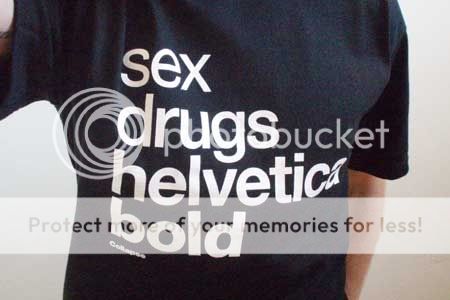
So, on to Helvetica. Yes, the font Helvetica, which was made into Helvetica the movie. When fonts can be optioned as movies, you know that we really are living in an age of wonders.

When I first started working in academic publishing a number of years ago, I really became interested in typography. I've even reviewed a book on the history of Syriac typography (very interesting . . . no, really). Typography can mean the art of printing or the art of typeface design. Both are interesting, but as much as a nonartist can be, I'm especially interested in type (fonts) as an aesthetic object, as functional art.
Fonts present a fascinating paradox. We use them and look at them all day long, but they are, unless we stop and think about them, completely invisible to us. They are the ultimate signifiers. No symbol provides a more transparent container for its meaning than the strokes that form a letter.
But a letterform is surprisingly plastic and allows a subtle but broad latitude for expression. Letterforms are evocative artistic objects that shape our response to the messages they are used to convey. They have a cultural power and provoke an aesthetic response that most of us, most (or all) of the time, are completely unaware of. Simple printed letters are the most ubiquitous artforms in our lives.
Today there are tens of thousands of fonts, but a bare handful dominate most typewritten communication. At the top of the heap may be Times New Roman, the default serifed font for Windows. It's ugly and I hate it and Microsoft has flooded the world with it. Blast Microsoft.
Apple, on the other hand, commissioned a stunningly beautiful font, Hoefler Text, with which to begin the era of computer typography. Obama has made it the default font for whitehouse.gov. Only Mac users can see it, though. Blast Microsoft.
Apple adopted Helvetica as their default sans serif font. It was a logical choice. Helvetica has dominated sans serif type usage since it was introduced in 1957. You see it every single day and almost certainly have no idea. As a font, I think it is beautiful, at least in light and medium weights, and very functional for a broad range of titling and short-form uses. Unlike Times, designers use it constantly, even after 50 years. All considered, it is perhaps the single greatest font ever drafted. But Microsoft did not want to pay a licensing fee for it when they introduced Windows, so they produced an ugly knockoff called Arial. No designer uses Arial. Yet again, blast Microsoft.

I recently watched Helvetica the movie and highly recommend it. It is indeed about the font, but much more about typography, its recent history and practice, and its invisible influence on us. It does a great job of communicating the mystery of the art. As an enthusiast, I got small thrill from the interviews with some leading typographers, especially Hermann Zapf.
Zapf's designed a number of fonts, including one in particular that everyone has seen and most people have used, Palatino Linotype.* Palatino is based on Zapf's own calligraphic handwriting. It is one of only five common fonts approved for use in my PhD dissertation, and is the one I am using. So Zapf's letterforms are my constant companions. They're unique and beautiful. I never get tired of them. To meet their creator, after a fashion, was a buzz.
Helvetica the movie may be purchased from iTunes or wherever fine documentaries on typography are sold. Some clips are available here. These include an outtake of the Zapf interview and a priceless few minutes with Erik Spiekermann ("[Fonts] are my friends. Other people look at bottles of wine, or whatever, or girls bottoms. I get kicks out of looking at type. It's a little worrying, I must admit . . .").

* Microsoft originally distributed only a knockoff of Palatino Linotype with Windows, which is called Book Antiqua. Starting with Windows 2000 they have also included the authentic, Zapf-produced version of Palatino. You'll still find Book Antiqua under your font menu, but accept no imitations.
I'll probably start blogging again in 2010. Maybe here, maybe on Tumblr, maybe not at all. Maybe I'll get serious about my Flickr stream instead. I'll be sure to let all of my readers know. Yes, both of you. Thanks.
So, on to Helvetica. Yes, the font Helvetica, which was made into Helvetica the movie. When fonts can be optioned as movies, you know that we really are living in an age of wonders.

When I first started working in academic publishing a number of years ago, I really became interested in typography. I've even reviewed a book on the history of Syriac typography (very interesting . . . no, really). Typography can mean the art of printing or the art of typeface design. Both are interesting, but as much as a nonartist can be, I'm especially interested in type (fonts) as an aesthetic object, as functional art.
Fonts present a fascinating paradox. We use them and look at them all day long, but they are, unless we stop and think about them, completely invisible to us. They are the ultimate signifiers. No symbol provides a more transparent container for its meaning than the strokes that form a letter.
But a letterform is surprisingly plastic and allows a subtle but broad latitude for expression. Letterforms are evocative artistic objects that shape our response to the messages they are used to convey. They have a cultural power and provoke an aesthetic response that most of us, most (or all) of the time, are completely unaware of. Simple printed letters are the most ubiquitous artforms in our lives.
Today there are tens of thousands of fonts, but a bare handful dominate most typewritten communication. At the top of the heap may be Times New Roman, the default serifed font for Windows. It's ugly and I hate it and Microsoft has flooded the world with it. Blast Microsoft.
Apple, on the other hand, commissioned a stunningly beautiful font, Hoefler Text, with which to begin the era of computer typography. Obama has made it the default font for whitehouse.gov. Only Mac users can see it, though. Blast Microsoft.
Apple adopted Helvetica as their default sans serif font. It was a logical choice. Helvetica has dominated sans serif type usage since it was introduced in 1957. You see it every single day and almost certainly have no idea. As a font, I think it is beautiful, at least in light and medium weights, and very functional for a broad range of titling and short-form uses. Unlike Times, designers use it constantly, even after 50 years. All considered, it is perhaps the single greatest font ever drafted. But Microsoft did not want to pay a licensing fee for it when they introduced Windows, so they produced an ugly knockoff called Arial. No designer uses Arial. Yet again, blast Microsoft.

I recently watched Helvetica the movie and highly recommend it. It is indeed about the font, but much more about typography, its recent history and practice, and its invisible influence on us. It does a great job of communicating the mystery of the art. As an enthusiast, I got small thrill from the interviews with some leading typographers, especially Hermann Zapf.
Zapf's designed a number of fonts, including one in particular that everyone has seen and most people have used, Palatino Linotype.* Palatino is based on Zapf's own calligraphic handwriting. It is one of only five common fonts approved for use in my PhD dissertation, and is the one I am using. So Zapf's letterforms are my constant companions. They're unique and beautiful. I never get tired of them. To meet their creator, after a fashion, was a buzz.
Helvetica the movie may be purchased from iTunes or wherever fine documentaries on typography are sold. Some clips are available here. These include an outtake of the Zapf interview and a priceless few minutes with Erik Spiekermann ("[Fonts] are my friends. Other people look at bottles of wine, or whatever, or girls bottoms. I get kicks out of looking at type. It's a little worrying, I must admit . . .").

* Microsoft originally distributed only a knockoff of Palatino Linotype with Windows, which is called Book Antiqua. Starting with Windows 2000 they have also included the authentic, Zapf-produced version of Palatino. You'll still find Book Antiqua under your font menu, but accept no imitations.
2 comments:
I'll miss ya. But Mark Twin was right when he said the worst thing for a writer was to become a newspaperman, because you get too used to seeing your name in print and put off working on the more difficult writing you have to do.
The biggest irony is that the day I decide to quit I get my first comment from a non-family member. I was clearly on the verge of a breakout . . .
Post a Comment